프로젝트명 데상트스포츠재단 브랜드 개발
카테고리 비영리 / 사회 공헌 / 스포츠
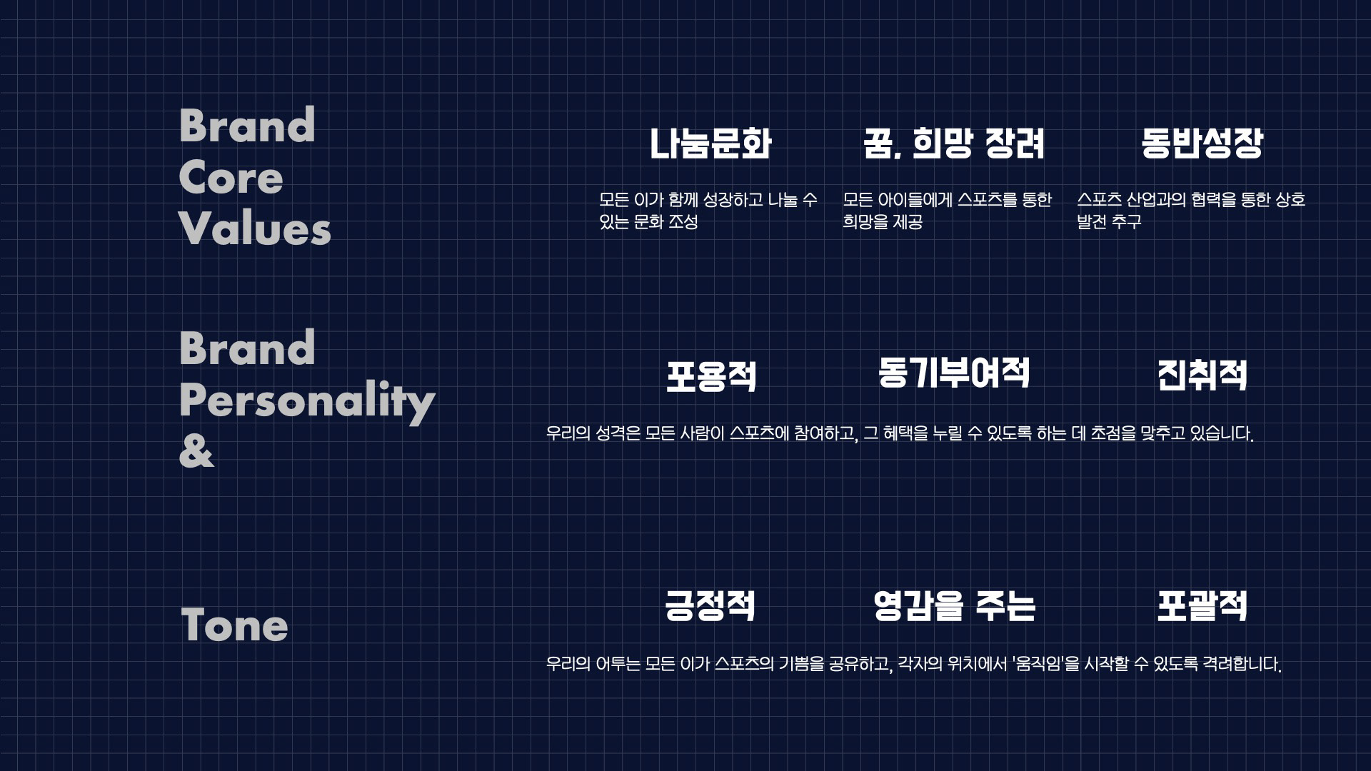
브랜드 배경 및 분석
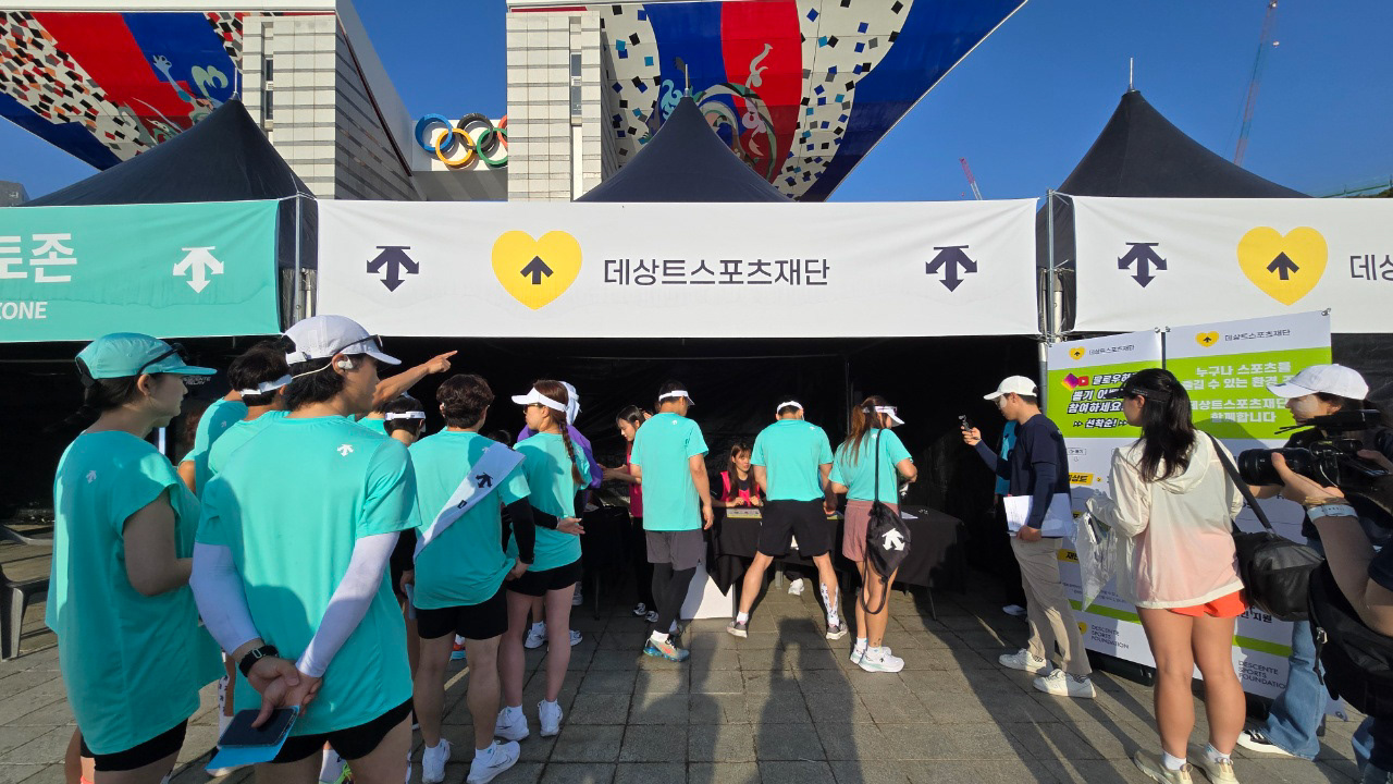
비용 효율 및 기업 이미지 제고가 주 존재 목적인 대다수의 대형 기업 산하 비영리 법인과 달리, 대외 홍보 없이 소외계층 아동, 청소년의 건강한 습관과 성장을 위한 스포츠 프로그램 개발, 운영, 기부에 집중해온 데상트스포츠재단의 창립 10주년을 맞았습니다. 더욱 많은 수혜자, 이들을 위해 협력할 기관, 기부자 확대의 목표를 가지고 브랜드 재정립, 브랜드 디자인 리뉴얼, 그리고 미래 전략 수립이 필요했습니다.
프로젝트 Scope
브랜드 아키텍쳐 재정립 / 브랜드 전략 수립
브랜드 아이덴티티 디자인
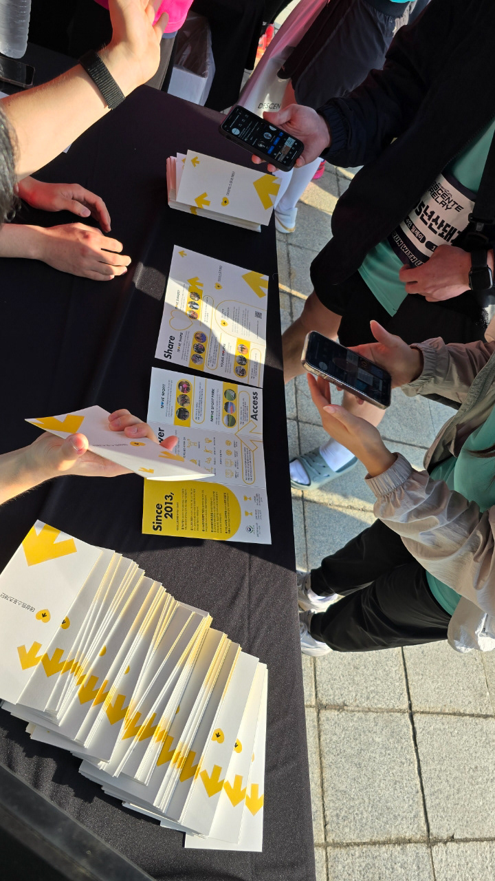
11주년 브랜드북 기획, 디자인 / 브랜드 커뮤니케이션 디자인
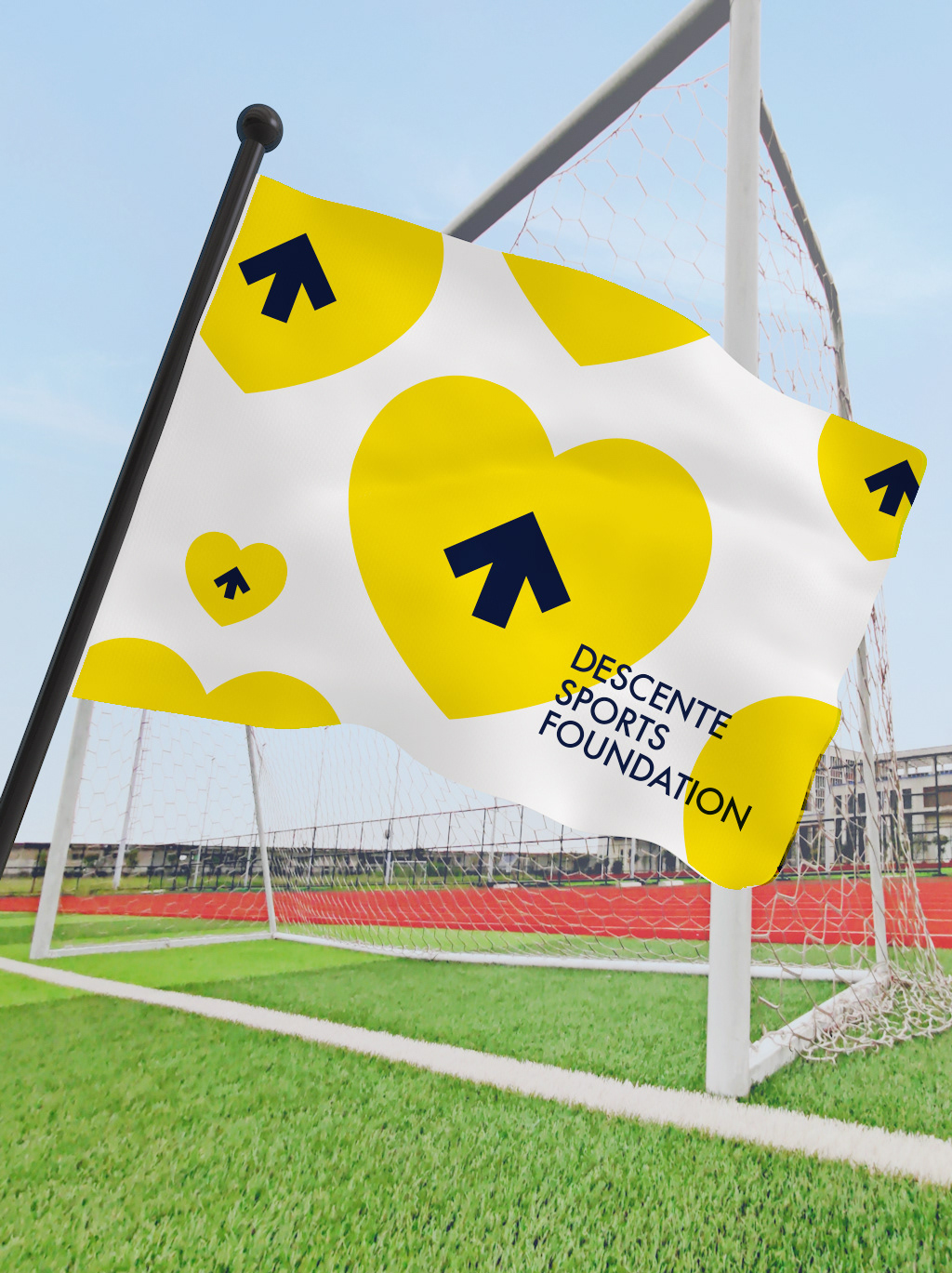
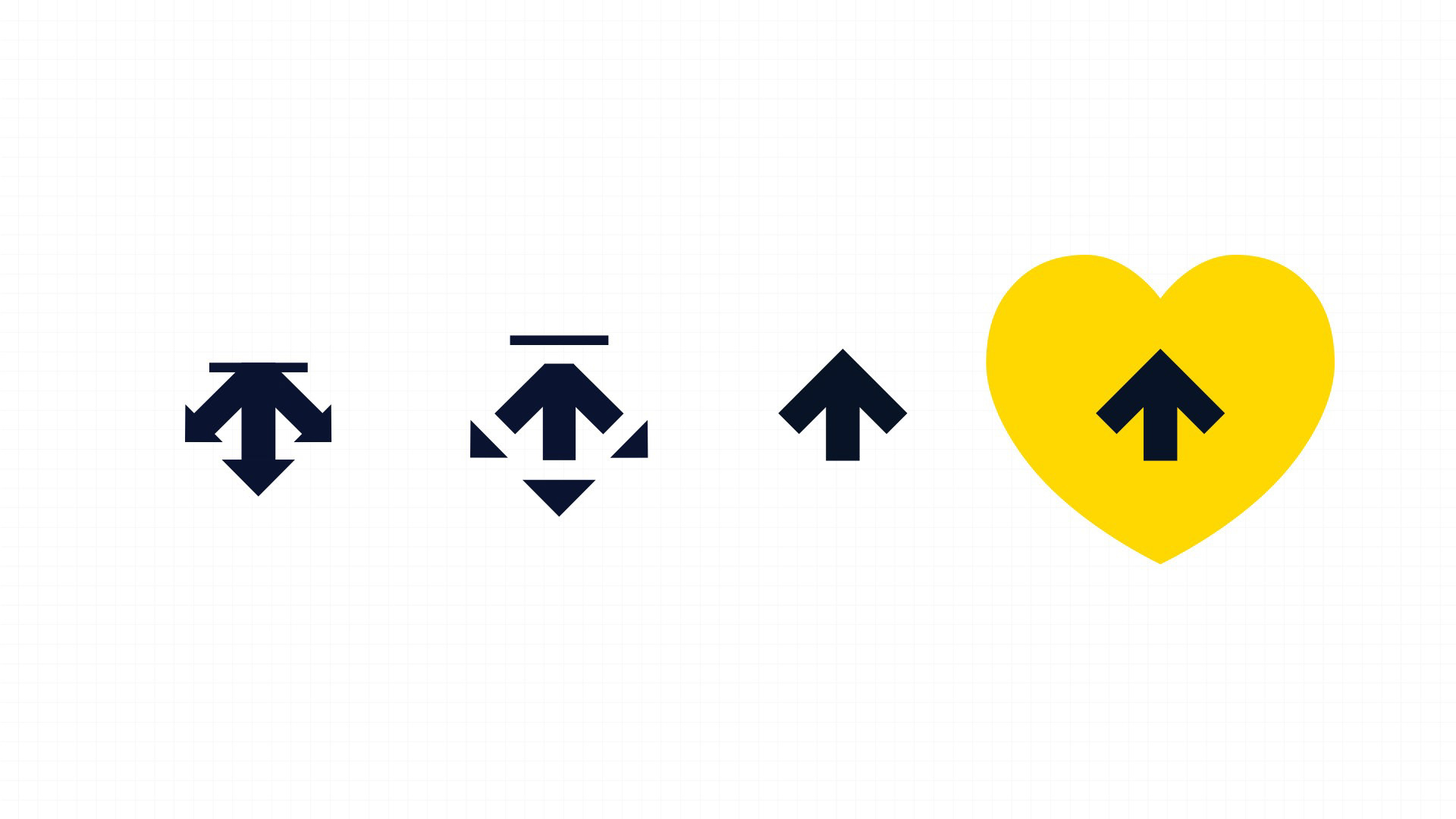
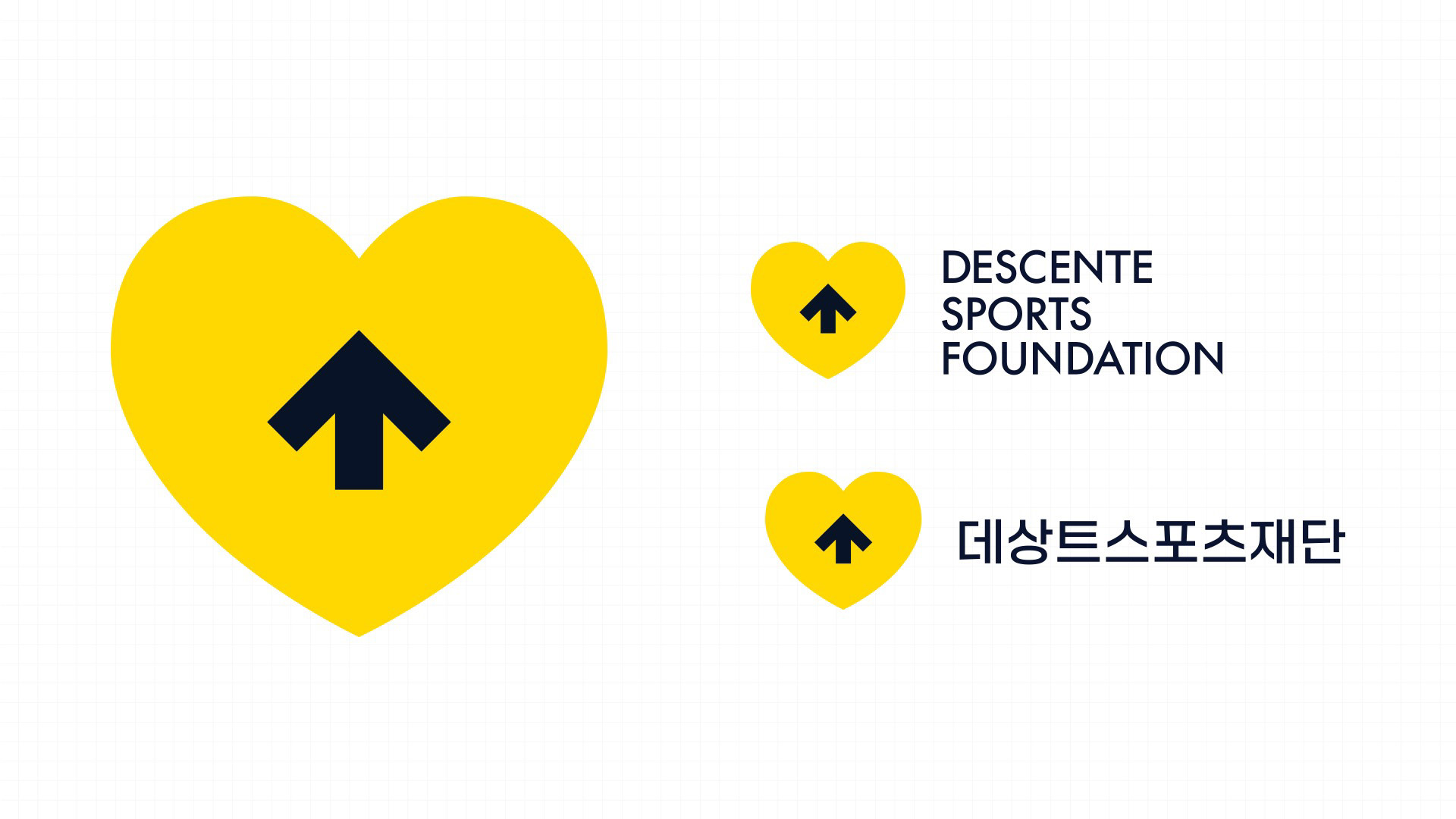
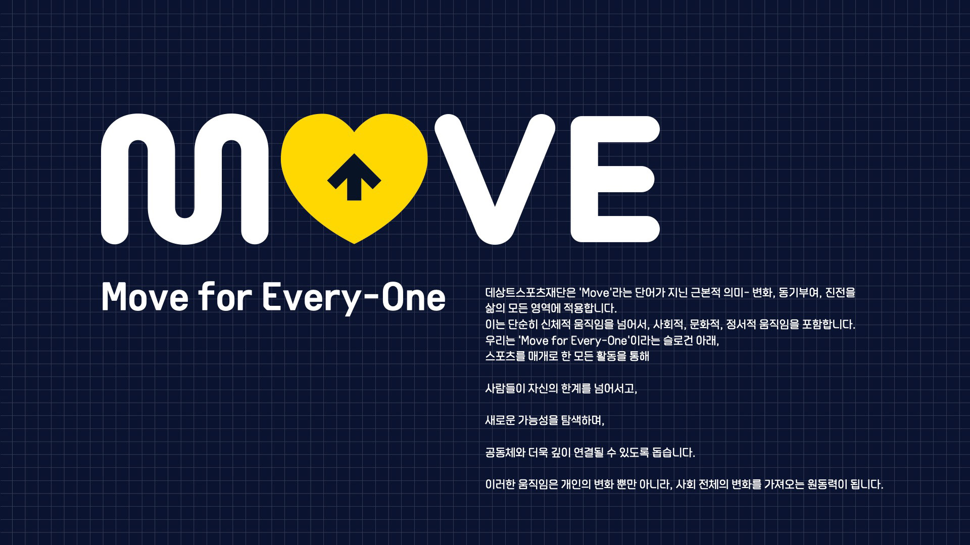
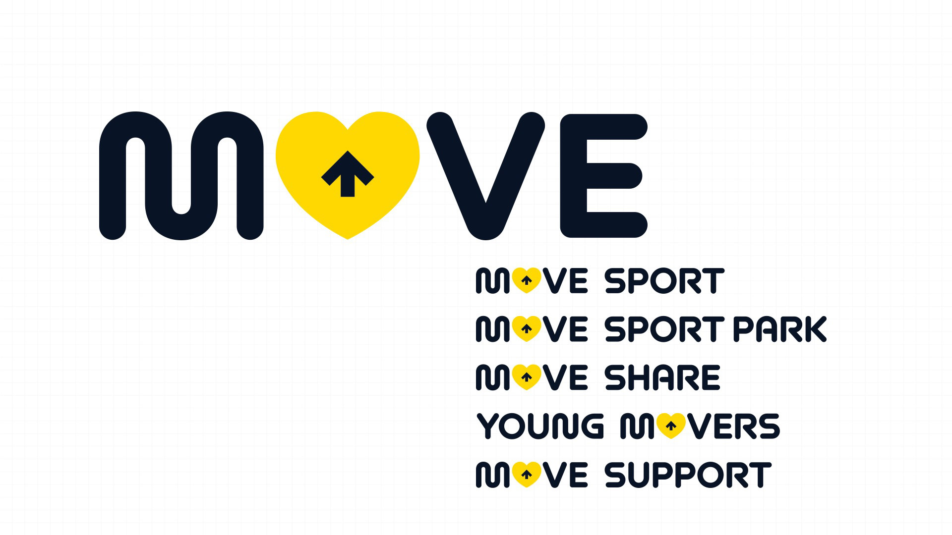
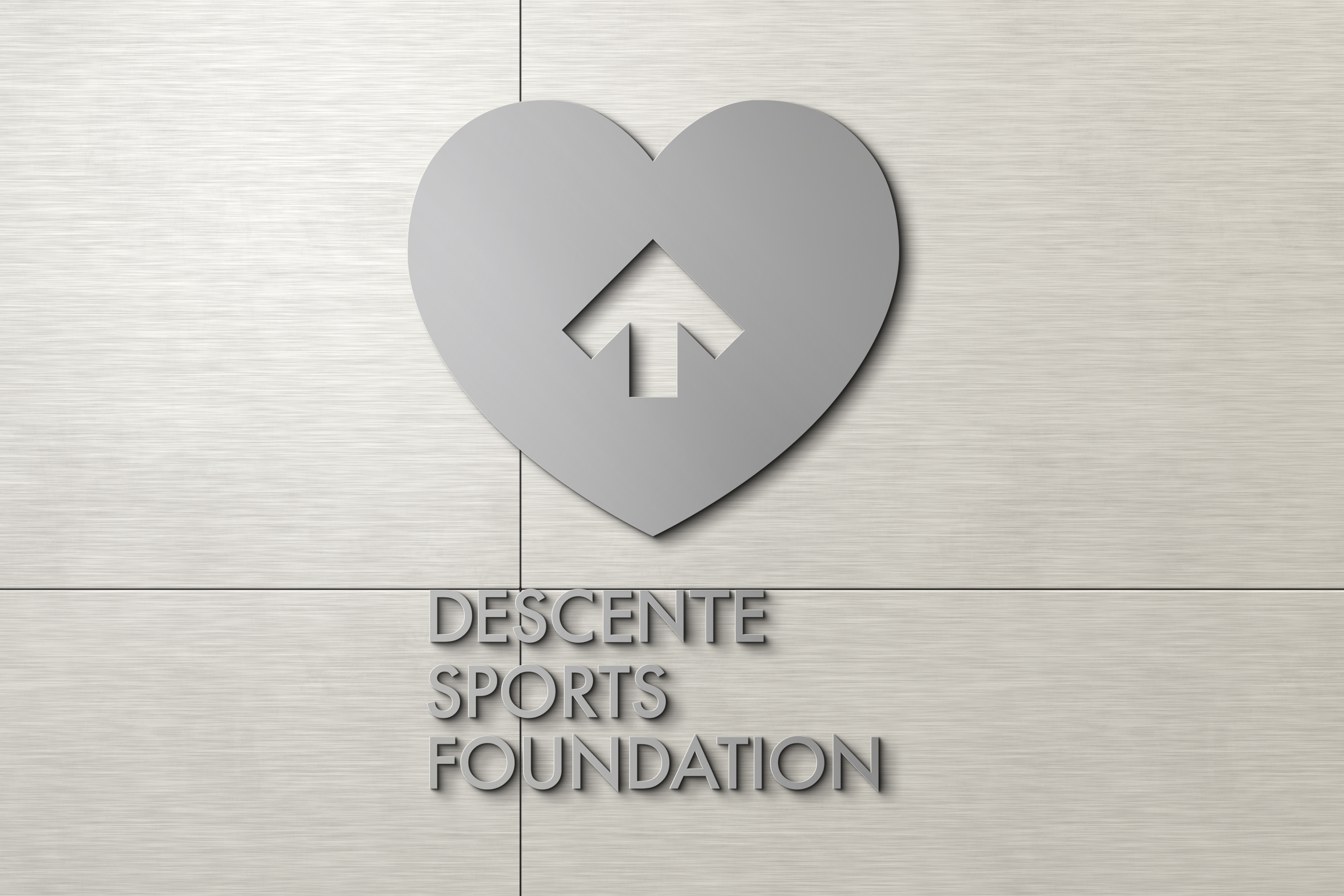
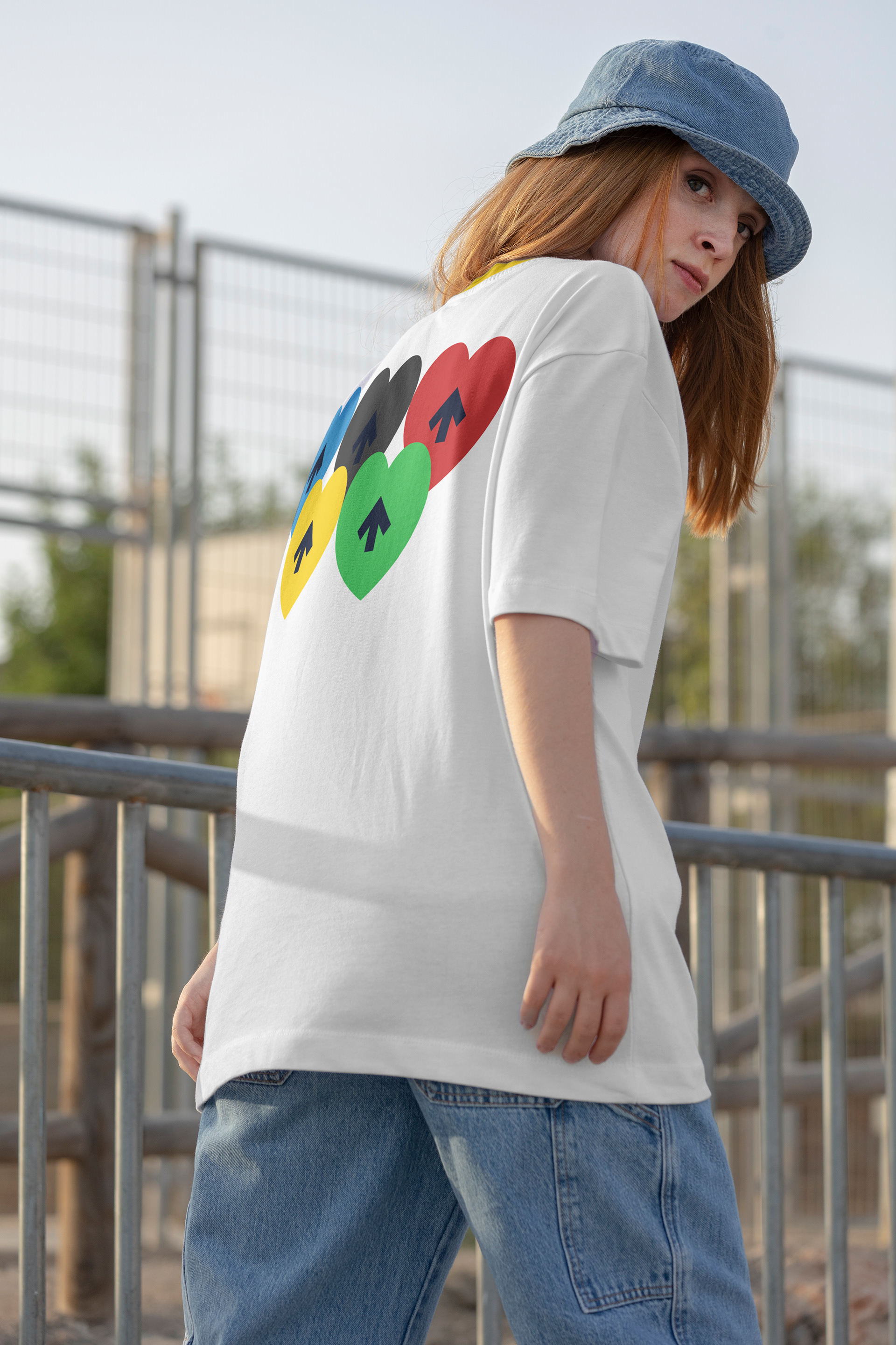
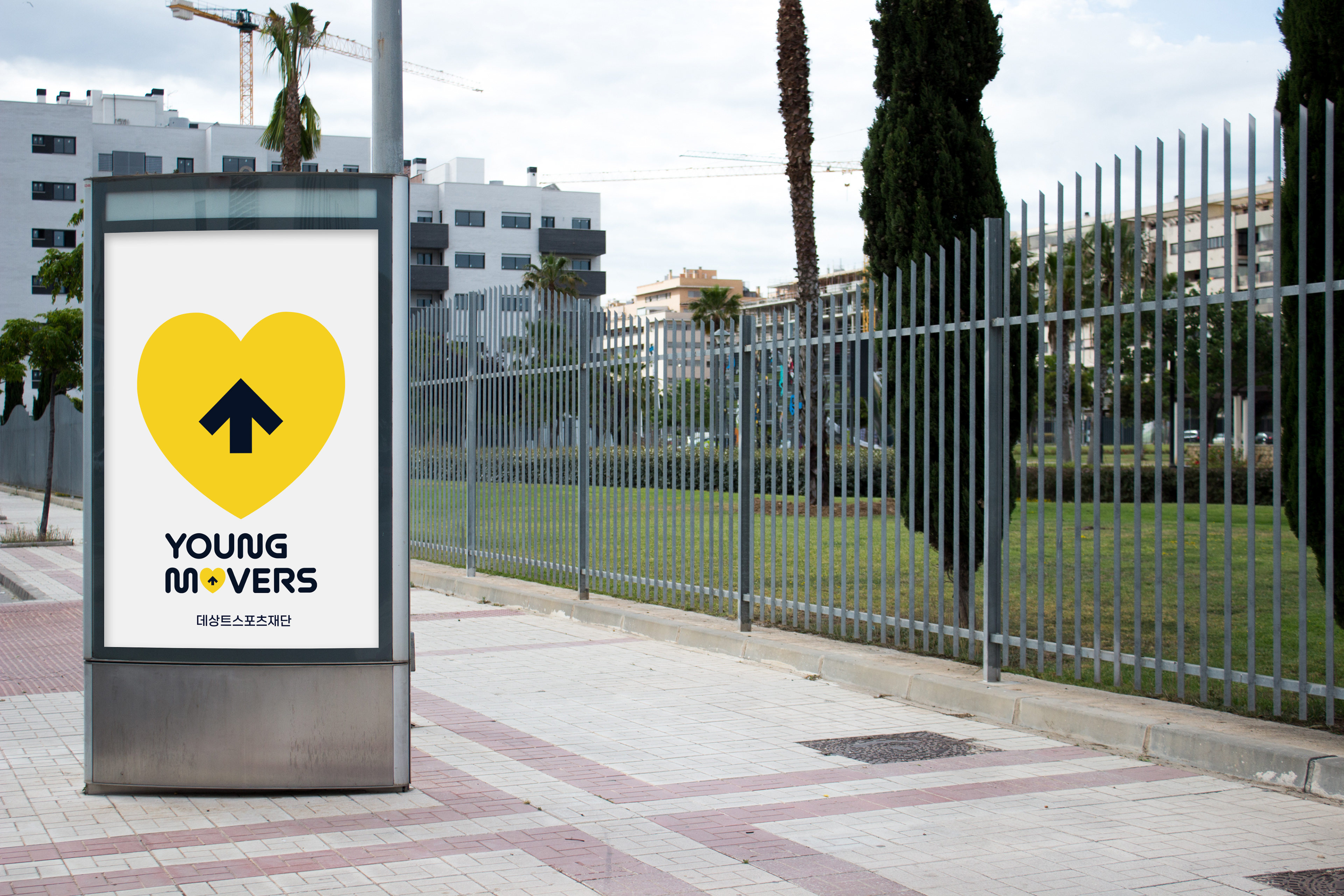
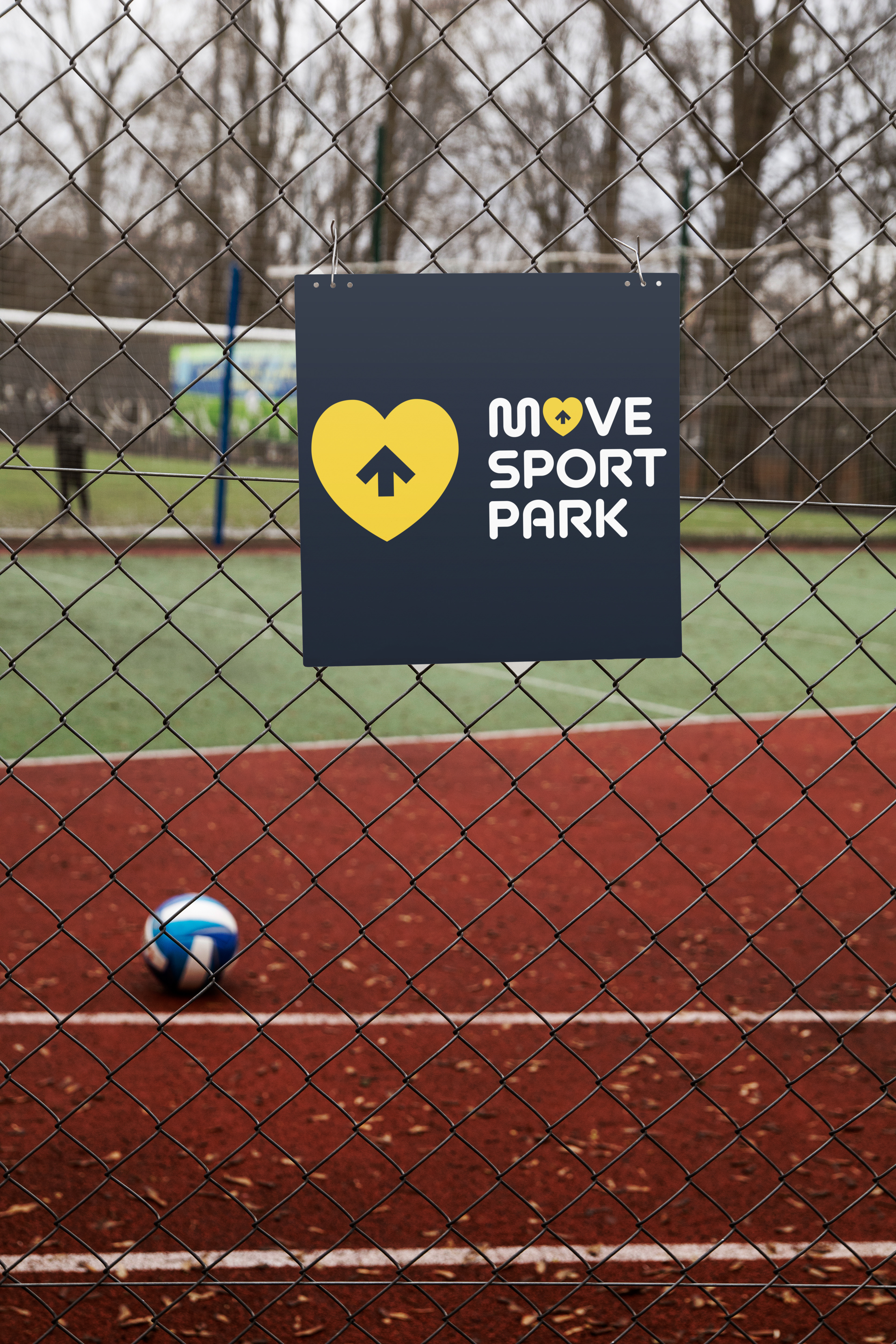
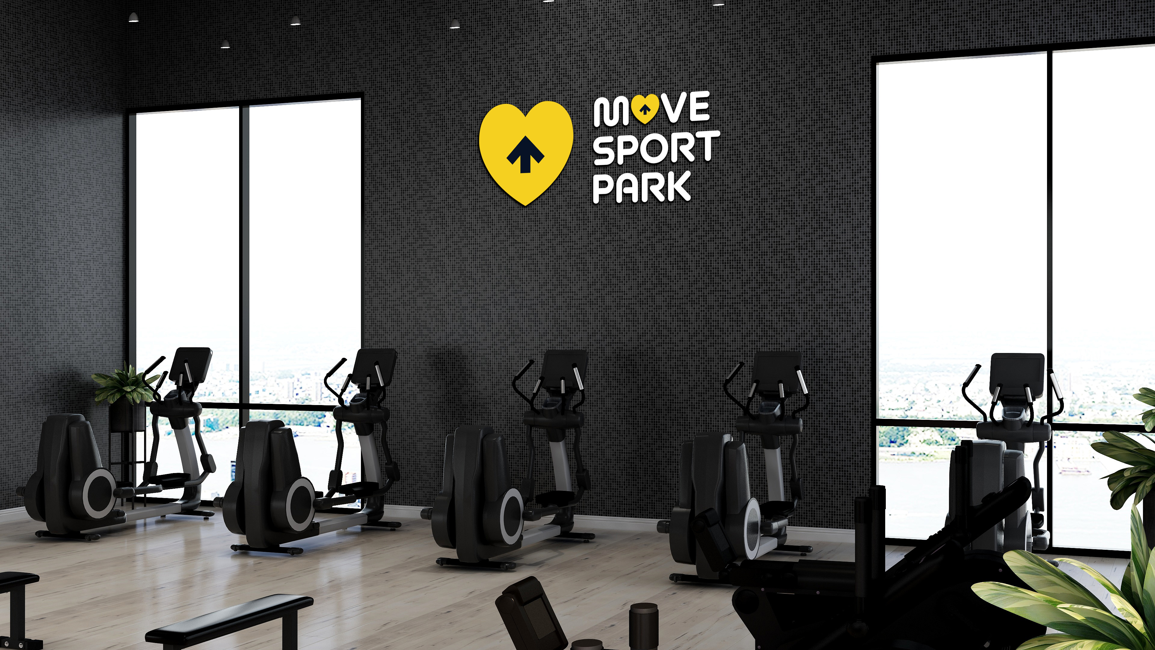
The dynamic descending arrow of the Descente symbol has been reinterpreted as an ascending arrow. This represents the connection to the founding of the Descente Sports Foundation and the name "Descente," while clearly articulating the foundation's mission to "lift someone up" through its activities. Additionally, this logo symbol is combined with a yellow heart that symbolizes love, care, sacrifice, and friendship.